
You own good pieces. A clean hoodie, a decent pair of sneakers, a jacket you paid too much for. And somehow, when you put them on together, it just doesn’t look right. That’s rarely a “you have bad taste” problem — it’s a color problem. Most streetwear outfits fail or succeed based on color logic, not price tag.
Streetwear color theory is the practice of choosing and pairing colors — using the color wheel, undertones, and ratios like 60-30-10 — so outfits look intentional instead of accidental. It borrows from classic art and design theory but applies it to real garments: hoodies, tees, outerwear, and sneakers, rather than paint swatches.
Once you understand the framework, you stop guessing. You start seeing why certain fits work and others don’t — and you can replicate that on purpose, every time you get dressed.
What Color Theory Actually Means for Streetwear
Traditional color theory comes from art class: primary colors, secondary colors, the color wheel, complementary pairs. Streetwear takes that same structure but strips it down to something more practical, because clothes aren’t paint. You’re working with fabric texture, brand logos, graphics, and a limited number of pieces at a time — usually three to five per outfit.
In streetwear specifically, brands often talk about a colorway — the specific set of colors a piece or a collection is released in. A hoodie might drop in a “black/grey” colorway and an “olive/cream” colorway. Understanding colorways matters because it’s how the industry itself thinks about color: not as isolated choices, but as a deliberate, limited palette designed to work together. That’s the same mindset you want to bring to your own closet.
The goal isn’t to memorize color science. It’s to build a small, reliable set of rules so you can mix and match without second-guessing every morning.
The Color Wheel, Translated for Your Closet
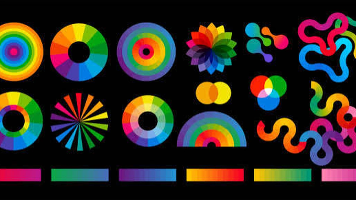
The color wheel groups colors by how they relate to each other. You don’t need the full art-school version — you need three relationships that actually show up in outfits.
Complementary Colors
These sit opposite each other on the wheel — think orange and blue, or red and green. In an outfit, complementary colors create high contrast and visual punch. A washed-blue denim jacket over a burnt-orange tee reads as intentional, not random, because the colors are working against each other on purpose. Use complementary pairing sparingly: one piece as the accent, not two competing statement colors.
Analogous Colors
These sit next to each other on the wheel — olive, forest green, and army green, for example. Analogous palettes feel cohesive and calm because the eye doesn’t have to jump between contrasting hues. This is a safer entry point if you’re still building confidence with color, and it’s a common look in earth-tone streetwear drops.
Triadic Colors
Three colors spaced evenly around the wheel — like red, yellow, and blue. Triadic combos are the boldest and hardest to pull off in clothing because three saturated colors at once can look chaotic fast. If you want to try it, let one color dominate (a red jacket), one show up moderately (yellow accents on sneakers), and keep the third small (a blue cap).
Quick takeaway: complementary = contrast and punch, analogous = cohesion and calm, triadic = bold but needs discipline.
Find Your Undertone Before You Buy Anything
Undertone is the warm, cool, or neutral cast underneath your skin’s surface color — and it changes how certain garment colors read against your face, not just each other.
A simple self-check: look at the veins on your inner wrist in daylight. Blue or purple veins usually mean a cool undertone; green veins usually mean warm. If you genuinely can’t tell, you’re likely neutral. Then hold pure white and cream near your face — whichever one makes your skin look brighter and less tired is your side.
- Cool undertones tend to look sharper in true black, navy, crisp white, and icy grey.
- Warm undertones tend to look better in cream, olive, brown, and washed black rather than jet black.
- Neutral undertones can usually wear both, which is genuinely an advantage — lean on it.
This isn’t about restricting your wardrobe. It’s about knowing which neutral base colors will do the most flattering work before you build the rest of the outfit on top of them.
The 60-30-10 Rule (With a Real Outfit Breakdown)
This is the single most useful ratio in streetwear color theory, and it’s borrowed directly from interior design: 60% of the outfit is a dominant color, 30% is a secondary color, and 10% is an accent.
Here’s what that looks like on an actual fit:
| Role | % of Outfit | Example Piece |
|---|---|---|
| Dominant | 60% | Black cargo pants + black jacket |
| Secondary | 30% | Grey hoodie |
| Accent | 10% | Burnt-orange sneakers or cap |
Most outfits that “feel off” without an obvious reason are actually broken ratios — a 50/50 split with no accent, or two competing dominant colors fighting for attention. If a fit isn’t working, check the ratio before you assume the pieces are wrong. Often, swapping one item into the 10% accent role fixes the whole outfit.
Build a Neutral-First Wardrobe, Then Add Color
Neutrals — black, white, grey, navy, beige, olive — aren’t boring by default. They’re infrastructure. A wardrobe built on four or five reliable neutrals means almost anything you own can be worn together, which is exactly why they show up constantly in strong streetwear capsules.
The mistake people make is buying color first and neutrals never, which leaves them with a closet full of pieces that clash because nothing shares a common base. Flip the order: build your dominant and secondary pieces (the 60% and 30%) from neutrals matched to your undertone, then use bolder colors almost exclusively as your 10% accent. This single habit solves most “nothing matches” wardrobe problems.
Monochromatic and Tonal Outfits
Monochromatic dressing — one color family in varying shades — is one of the easiest ways to look put-together without doing much color math at all. An all-black outfit that mixes matte cotton, ribbed knit, and leather isn’t flat, because texture does the visual work that color contrast usually does.
Tonal dressing works the same way with a slightly wider range: charcoal, light grey, and off-white in one outfit, for instance. The trick is contrast through texture and fit, not color — a boxy jacket over a fitted tee, or matte fabric against something with a slight sheen. Done well, monochrome reads as deliberate, not like you ran out of ideas.
Color Psychology in Streetwear Branding
Color communicates before anyone reads your outfit’s logo. Red signals energy and confidence, which is why it’s common in graphic-heavy statement pieces. Blue reads as calm and reliable — a common choice for understated, “quiet luxury” streetwear. Black remains the default for a reason: it reads as versatile and slightly serious, which is part of why it dominates so many core drops.
This is also why restrained brand palettes work so well commercially. Labels that build bold graphics on top of a disciplined neutral base — black, grey, washed tones, with color used only as controlled accent hits — are applying exactly the 60-30-10 logic at a brand level, not just an outfit level. A loud print needs a stable color foundation to actually land; without one, the eye doesn’t know where to rest.
Seasonal Palette Shifts
Streetwear color trends shift with the season, and it’s worth adjusting your accent colors rather than your whole wardrobe. Colder months lean into richer, deeper tones — burgundy, forest green, deep navy — which read heavier and pair naturally with outerwear. Warmer months shift toward lighter, brighter accents — pastels, washed pastels, and lighter neutrals like stone and cream — since heavier saturated tones can feel out of place with lighter fabrics.
Your neutral base doesn’t need to change season to season. Just rotate what fills the 10% accent slot.
Common Color-Matching Mistakes
- Two dominant colors competing. Two saturated, high-contrast pieces at 40%+ of the outfit each fight for attention. Pick one to dominate.
- No accent at all. An outfit built entirely from the 60/30 split without any 10% pop can look flat and unfinished.
- Ignoring undertone on big pieces. A warm-undertone person wearing stark, cool-toned black on a large jacket can look washed out — swap to washed black or charcoal.
- Mixing multiple bold patterns. Two graphic-heavy pieces at once usually reads as cluttered rather than intentional, even if the individual colors technically work.
- Treating color as an afterthought. Buying pieces you like individually, with no shared base color, is how closets end up full of good items that never combine into a good outfit.
Quick Takeaway: Pick your neutral base first, match it to your undertone, apply the 60-30-10 ratio, and let one accent color do the talking. Everything else in streetwear color theory is a variation on that.
Once this framework is second nature, building an outfit stops being guesswork — you’ll be able to look at any two pieces and immediately know whether they belong together, and if not, what small swap would fix it.
READY FOR MORE STYLE IDEAS? BROWSE MORE STREETWEAR GUIDES AND KEEP BROWSING.
FAQ Section
What is the 60-30-10 rule in streetwear?
It’s a color ratio for outfits: 60% dominant color, 30% secondary color, and 10% accent color. It keeps outfits balanced instead of looking like a random mix of pieces competing for attention.
How do I know my color undertone?
Check your wrist veins in daylight — blue-leaning means cool, green-leaning means warm. Then compare how white versus cream looks near your face; the brighter option confirms your undertone.
What colors go well with black in streetwear?
Almost everything, which is why black is a core neutral. It pairs cleanly with grey, white, olive, navy, and works as a stable base for one bold accent color like burnt orange or red.
Is monochromatic streetwear boring?
Not if you vary texture and fit. Mixing matte cotton, ribbed knit, and different silhouettes within one color family keeps a monochrome outfit visually interesting.
What is a colorway in streetwear?
A colorway is the specific set of colors a garment or collection releases in — for example, a hoodie dropping in both “black/grey” and “olive/cream” versions. It’s how brands apply color theory at a product level.
How many colors should an outfit have?
Two to three works best for most outfits: one dominant, one secondary, and a small accent. More than three saturated colors usually starts to look cluttered.
Do streetwear brands actually follow color theory?
Yes. Many build bold graphics or logos on top of disciplined neutral bases — black, grey, washed tones — using color theory principles like restrained palettes and controlled accent hits at a brand level.
What colors should I avoid mixing?
Avoid two high-saturation dominant colors at similar proportions, and avoid multiple bold patterns in one outfit. Both tend to compete rather than complement.